◆TITLE
ペットショップのホームぺージ / Pet shop homepage
◆SKILLS/TOOLS
Photoshop/ Illustrator/ XD/ HTML/ CSS / JavaScript
◆REQUESTS
クライアントは、WEBの知識は多少あるが、サイト作成を断念したことがあり、出来れば更新作業はしたいというご希望。今後、宣伝やお問合せを受けたい為、今回サイト制作を受注した。
◆コンテンツ
- 販売ページ 小動物の画像&値段
- ギャラリーページ 小動物の画像
- お問い合わせフォーム
- 会社概要(あまり目立たない程度)
◆デザイン
- 背景は白、水色、ピンクなど
- ゴシック体で見やすいフォント
- 画像中心のサイト
- シンプル、可愛らしいサイト
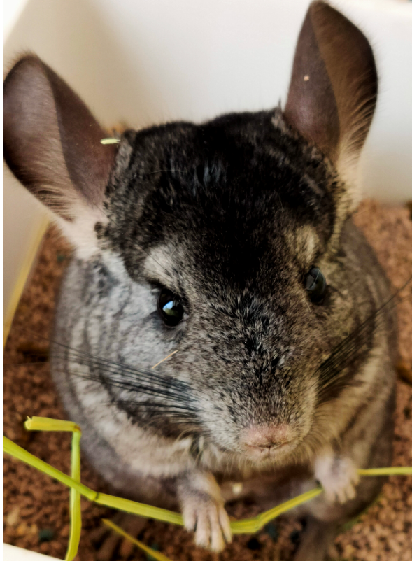
- チンチラ(動物)のイラストのロゴ
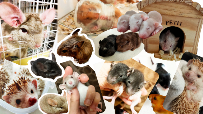
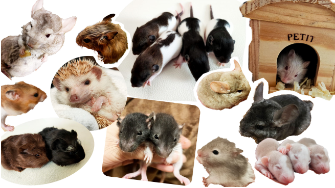
- コラージュのキービジュアル
◆このサイトにおける目標
小動物が好きな人に問い合わせフォームから問い合わせをもらい、
実際の来店に繋げる。
お問い合わせボタンを分かりやすい位置に配置し、各動物販売の場所にも配置することで、お問い合わせボタンとの接触率をあげ、クリック率を上げる。
色もキーカラーの補色に設定し、目立たせる。
◆クライアントの希望
ご自身でもサイト運営をしたいということから、後からでも画像を追加しやすいレイアウトにする。
問い合わせフォームはgoogle formを埋め込み、スプレッドシートなどで管理しやすくする。
The client has some knowledge of the web, but has given up on creating a website and would like to update it if possible. The client wants to advertise and receive enquiries in the future, so the client has ordered the creation of the website.
◆ Contents
Sales page: images and prices of small animals
Gallery page: images of small animals
Enquiry form
Company profile (not too obvious)
◆Design
White, light blue, pink etc. background
Gothic, easy-to-read font
Image-oriented site
Simple, cute site
Logo with chinchilla (animal) illustration
Collage key visuals
◆Objectives for this site
To get people who like small animals to inquire through the enquiry form,
To lead to an actual visit to the shop.
To increase the contact rate with the enquiry button and the click rate by placing the button in an easily recognisable position and also in each animal sales location.
The colour is also set to the complementary colour of the key colour to make it stand out.
◆Client’s wishes
The client wants to manage the site themselves, so the layout was designed to make it easy to add images afterwards.
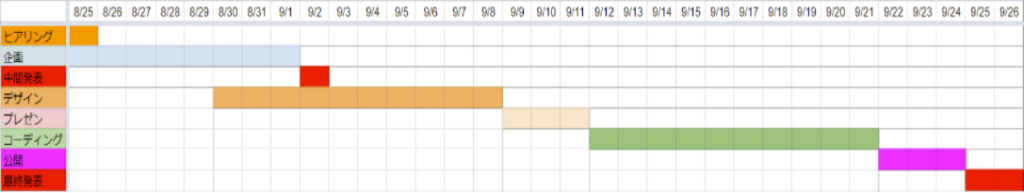
◆PRODUCTION TIME
制作期間1ヶ月(デザイン1週間/コーディング1週間/修正1週間/打合1週間)
概ね予定通りに進んだが、クライアントとのデータ・確認のやりとりにおいて 多少予定が前後した。
Production period 1 month (1 week for design/ 1 week for coding/ 1 week for revisions/ 1 week for meetings)
Generally progressed according to schedule, but there were a few delays in exchanging data and confirmations with the client.
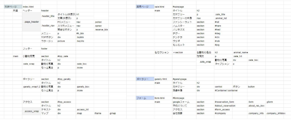
クライアント自身でも更新をしたいという希望のため、パス設定を表にまとめた。
Due to the clients’ wish to update the path settings themselves, the path settings are summarised in a table.
◆SITE
フォント/ Fonts :noto sans JP
カラーコード / Color codes: #A9E1FE #D4946F #FFE259 #FFC0CB
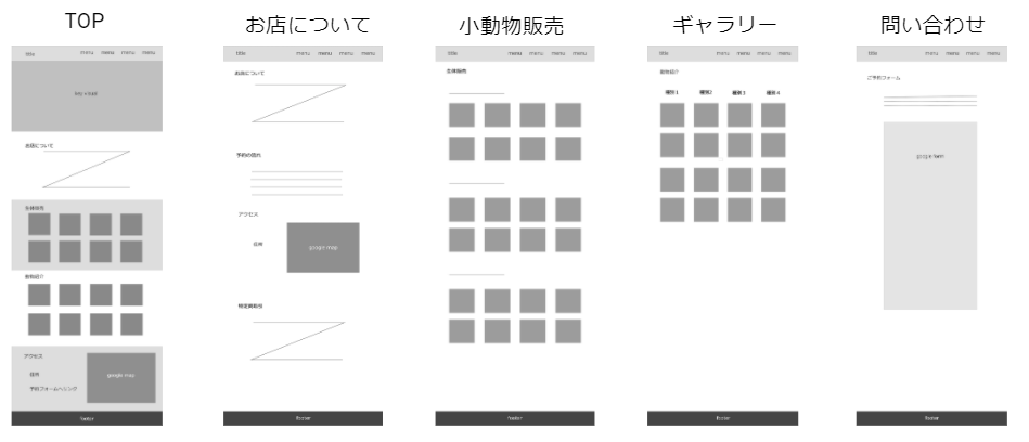
最初にクライアントに提示したワイヤーフレーム
Wireframes initially presented to the client.
ヒアリング・ワイヤーフレームをもとに作成したサイトマップ
Site map created based on interviews and wireframes
◆ロゴデザイン / logo design
チンチラのロゴ依頼のため、写真をもとにIllustratorで作成
Created in Illustrator from a photograph for a chinchilla logo request.
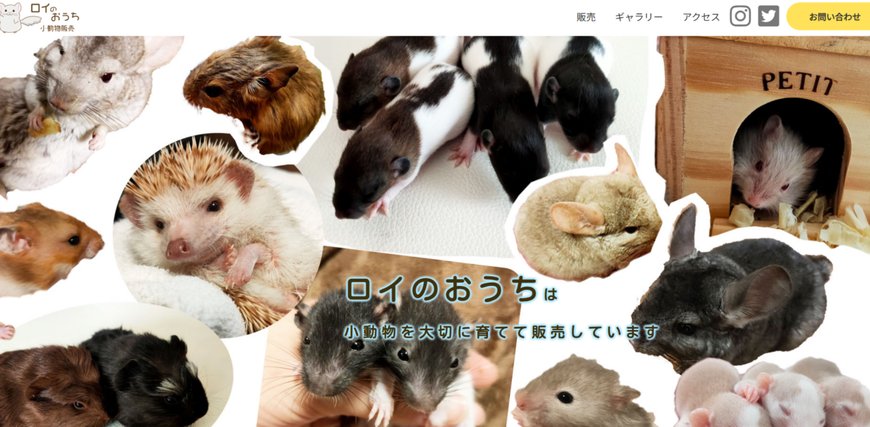
◆キービジュアル(コラージュ)/ Key visuals (collage)
余白が欲しいということから、B案に決定した。/ The decision was made to go with proposal B because of the need for margins.
◆POINT
ヒアリング、デザイン、コーディング、サーバーアップまで一貫して担当した。
ヒアリングの際に、ヒアリングシートを用いたが、 同じ”かわいい”でも、どのような”かわいい”なのかが、個人の価値観によって異なるため、 細かいニュアンスの部分を、汲み取ることが難しいと思った。 また、最初の時点で出来るだけゴール地点をお互いにすり合わせることで、 今後の作業や打ち合わせに無駄がなくなるため、 ヒアリングが実は一番大事かつコミュニケーションが必要となる作業と感じた。その後も、画像を送っていただいたり、 デザインを確認していただいたり、 その都度細かなやりとりが必要となるため、 自分から伝えるときも端的に、分かりやすく伝えることを心掛けた。
I was in charge of everything from interviews to design, coding and server upload.
We used a hearing sheet for the interviews, but even if it is the same ‘cute’, what kind of ‘cute’ it is depends on the individual’s sense of values, so it was difficult to grasp the detailed nuances, It was difficult to understand the detailed nuances of the word ‘cute’. In addition, we felt that the hearing is actually the most important and communicative part of the process, as it is important to agree on the goal point as much as possible at the beginning, so that there is no waste in future work and meetings. After that, I tried to communicate in a straightforward and easy-to-understand manner, as detailed communication was necessary each time, such as when I asked the client to send images or check the design.